Wednesday, December 31, 2008

NOT a December 31st list

Since I'm not one to wax nostalgic at the end of a year or one to ascribe more to the date December 31 than the fact that tomorrow will be January 1, this will not be a year end round up, look back, best of, worst of, or any other kind of list. Promise. Rather than looking back as an opportunity to summarize and categorize, I thought I would take the opportunity to post a few comments on things I saw that slipped through the cracks. These were artists, events, and exhibitions that I had intended to write about, but, what with my usual procrastination, the moment seemed to pass. So now, in no particular order, some cool stuff I neglected to comment on in 2008:

I fell in love with a little Hungarian book I found at Mai Manö, the Hungarian House of Photography in Budapest, that shows the studio stamps of Hungarian photo studios from 1883 forward. You can look at the cover and order it (in Forints) here, and you can look at the kind of thing you'll find inside by looking here. There isn't a single photo in the book, only the backs of photos, but I love it. It really captures some essence of an age when photo studios were in full bloom. The designs of many of them are Deco or Nouveau, quite ornate and beautiful. The ISBN is: 9789638661845

Also from Budapest is a small book of the postcards of Lenke Szilagyi, published by my friend Attila Pöcze from Vintage Gallery. Mail art was a common thread for artists in the newly open East in the 80s. Ms Szilagyi sent dozens of unique photos glued onto common postcard stock bought cheaply at the post office to friends in Hungary and abroad. It's a remarkably personal and beautiful book. It deserves a show of its own as Ms Szilagyi deserves wider recognition in the West. I believe she would have had a career at least as well-known as her fellow countrywoman Syvia Plachy if she had come west as Ms Plachy did. There are many books available. Check her out. Here's the cover of the postcards book, "Single Lens":

In Berlin at Art Forum I was intrigued by the work of Veronika Kellndorfer at Christopher Grimes Gallery. Ms Kellndorfer explores modernist architecture in an innovative way. She silkscreens her images onto very large panes of glass. The effect is to be actually inside of what she is photographing and looking out into the world. Because the work is on glass, it's highly reflective so you see your own image and the reflection of the room you are in as well as the "vista" the artist represents. As trompe-l'œil it's completely effective and beguiling. I also found its commentary on perspective and space to be satisfying. Whether these are a fair exchange for the challenges of owning such large, fragile work remains a question for me. They are very much worth seeing. Here are a few installation shots from the gallery, though the full effect is of course lost in a photo for work like this. It's interesting to note that the first two pictures are opaque while the second pair are translucent. If you focus, you'll see that in the second two you're actually looking through the glass into the aisle behind the booth:


Also during Art Forum, Sarah Oppenheimer had a fab exhibition of her mind-bending, form bending, wood bending sculptures at Duve Gallery. I raved about her work at a group show over the summer at the Mattress Factory in Pittsburgh. This new show didn't disappoint either. An artist to watch.

In Paris during Paris Photo there was an exhibition that was one of the year's best for me. It was called, "Academia, Qui-es-tu?". It was assembled/curated by Axel Vervoordt. Readers of this blog will remember how ecstatic I was over an exhibition in Venice during the biennial called Artempo also curated by Mr. Vervoordt. It turns out that the Paris show is part two of a planned trilogy of which Artempo was part 1. The web site for the exhibition and where you can purchase the catalogue is here. Like the Venice show, this exhibition was presented without wall labels, without text, and without preface. A visitor is handed an exhibition list when you walk in so, if you so desire, you can find out what you're looking at. Otherwise, you are invited to simply look. Simply look??!! Wow, what a concept.

The work on display was, like Venice, a range of styles spread across centuries. Without curatorial guidance, my mind was able to plumb connections, to create connections, and to wander creatively amid a throng of artistic ideas. It was bliss. Mind you, a show like this could easily go wrong. It could have been just a mish-mosh of work and styles thrown together with the hope that there was a connecting thread. For me this was not the case. For example, an Ad Reihardt painting with its cruciform structure was next to 18th century, rectilinear bas-relief. In front of the brooding, sepulchral Reinhardt was an actual sarcophagus. I found these relationships to echo off each other beautifully.
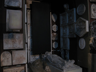
Here, a fabulous Anish Kapoor "monument" amid monuments:


Boltanski et al:

A timeless tableau of work in stone with a detail of the contemporary example by Renato Nicolodi:


The final third of the trilogy will be at the Venice Biennial next year. Don't miss it.

I saw an unforgettable installation in Bratislava by the Slovak artist, Matej Krén. Titled "Passage", it creates an infinity of books in a space that feels lost in time. Apparently it's been seen in the US, but clearly deserves wider recognition. Some installation views and close-ups:


Looking up:

Close-up

The show in which I saw this was an overview of contemporary Slovak art. There was quite a bit of first rate work. Clearly this country deserves to be seen more on the international stage.

Last. a few shots of a public art work/art creation in Budapest; a large camera obscura project right on one of the main streets. Public Art Fund take note, this would be a fantastic project for New York.


Thank you to all of my readers in 2008. My number of hits grew substantially this year. I am grateful to you all. More to come in 2009. It's 11:49 as I type this last period. I snuck this last post in just under the wire!

Thursday, December 18, 2008

Baer-Ridgway and last Miami thoughts

I find it impossible to chart any degree of consistency of quality in the fairs from year to year. It seems that one year Aqua is good but Scope is bad; the next year Scope is great and Pulse is bad. I'm hard pressed to think of a Miami fair that was consistently exciting over 3 straight years. Lat year I thought that Aqua was really running into problems. They had expanded into two fairs -- the original one in the hotel on South beach and new one in Wynnwood. Pulse, too, last year was a major loser for me. (I know these ratings are highly subjective. Many friends disagreed with me about Pulse last year). But I found both fairs did a major turnaround in 2008. Pulse had consistently fine work from many good galleries, and Aqua seemed to have made a case for why they needed two venues.

Last year I thought that there were just too many satellites. If only a few of the fairs could contract, it would make for fewer but better fairs. Aqua was high on my list for being in need of this edit. But lo and behold, this year it was again a very strong fair. I'm always impressed with what Gallery Joe brings from Philadelphia, and my friend Gail Gibson had a strong booth from Seattle. Tom Robertello's gallery from Chicago is also a sleeper hit with fine contributions every year. At the South beach site, Paul Kopeikin was displaying his solid program while Eleanor Harwood from San Francisco had the intriguing and obsessive work of Jill Sylvia. All worth a look.

The best new "find" for me was Baer Ridgway Exhibitions from San Francisco. They have a new portfolio based on the theme of a bridge curated by Jens Hoffmann that is just flat out first-rate. It's a steal if you figure the price per photo, and the work included is fabulous. I was particularly taken with the work of Simryn Gill, Luisa Lambri, and Tim Lee. Look here to see photos of all 1o images in the portfolio. If you've got the scratch in these hard times, I think it would be tough to find a better deal than this one. Also, the non-photographic editions by Margie Livingston and Jeffrey Simmons are pretty great, too. An auspicious start for a new gallery.

That's it for Miami from me. I'll be curious to see how the scene is manifested next year after a tough financial year.

Wednesday, December 10, 2008

Creative Destruction at Miami/Basel 08

Establishing a taxonomy for my Creative Destruction (CD) idea has been challenging. What is the simple definition of destruction? How is the art I include different from collage? If the artist is not intending to represent the idea of destruction, is it still destruction if I see it that way?

These ideas were all vying for attention as I looked at the work of the following three artists while I was in Miami. The first artist, Tim Hyde, was perhaps my favorite artistically, but the most problematic in terms of including him in CD. One could certainly argue that Mr. Hyde simply engages in classical collage technique. I'm not so sure. I think two factors argue for his inclusion in my CD category. First is his surgical precision in slicing then repositioning his photos into a seamless construction. This means he is taking multiple photographs of a scene expressly to cut them so they will fit into a deconstructed scene. Second, I think the fact that he is playing with time and space by using multiple shots of the same locale gives me the idea that he is slicing his work in his head even as he is taking the picture -- i.e. there is no intention for the photograph to ever remain whole. It will be "destroyed" in order to be used creatively in the whole. I think this is a key distinction. The pristine object is created in ORDER to be taken apart. It is not found or included whole.

On an artistic level, I am very taken with this work. I love how his constructions make ordinary space sculptural and how it bends the time/space parameters of a two dimensional object. He shows at Max Protech in NYC. Here are a few examples.


Next up for debate in my mind was Roberto Pellegrinuzzi showing at Pierre -François Ouellette Art Contemporain. Mr. Pellegrinuzzi makes images by layering bits of information on multiple layers of plexi or glass. It's unclear to me whether the image starts its life as a whole photograph which he then slices down to bits a reconstructs in a multi-layered form. If that is indeed his process, well, I'm sold that he's solidly in the CD camp. If his process is somehow more arcane than that or if he "paints" with bits of film in order to create an image, then I would say the art is still fascinating but it maybe doesn't quite fit in CD. The few images I saw were lovely, complex and beguiling. I'm told that he has a diverse and interesting practice that includes large-scale installations. Worth taking a look especially because Pierre-François runs a fine gallery with a top, top program. Here is an example that is not terribly elucidating. It's tough work to represent in a photo:

Same image in a slightly raking view:


The last artist I'll discuss in this post was the easiest from a taxonomic point of view. The fact that his images are cut, torn, and finally sewn back together with thread are an easy call for inclusion in CD. His name is Germán Gómez. He was showing at Galería Fernando Pradilla. Mr. Gómez' work frequently explores homosexual themes, especially as that relates to outsider status, legal status, and gays' relationship to the church. In the work that is explicitly CD, he usually uses multiple models whose parts are cut and torn then sewn back together as one figure. The sexual and human metaphors are obvious but I find the work quite successful.

Laurent Horacio Bert de la Serie Compuestos, 2004

Claudio Guillermo Antonio Jose de la Serie Compuestos, 2004.

In a series called "Registered and Tattooed", he photographs men he has known that have been tattooed with some idea from Gómez' life. Then, a police dossier is created which shows the man with the tattoo as an identifying (and, perhaps, prosecutorial) device. The relationship between the personal world of homosexual love relationships and how the law sees them is bleakly portrayed. Strong work.


So my search for an all-inclusive definition of Creative Destruction continues. The important thing for me is that the process of sorting it out leads me to interesting and compelling work. As always, I invite your thoughts and suggestions.

Ernst Caramelle at Tracey Williams

Photography (Greek "drawing with light" from photos = light, and graphis = stylus, paintbrush or graphê = representation by means of lines, drawing)

There's a fabulous show at Tracey Williams, Ltd Gallery through December 23rd. The artist is Ernst Caramelle. In the ground floor gallery space are works that, while not made with a camera or with photo paper, are definitely photographic in the sense of the Greek roots of the word. Mr. Caramelle leaves colored paper out and exposed to the sun for years at a time. I assume he uses a variety of shapes and stencils to achieve the geometries and spatial effects we see in the work. They are photograms is some very basic way without using paper that has a layer of photosensitive chemical salts on the surface. The work brought to mind a combination of 1830's printing out prints that used sunlight to limn leaves and bugs with the subtleties of Morandi still lifes with their amazing use of liminal color. I was prepped to expect good things by a number of positive reviews, but the work still surprised me in its complexity and beauty. Isn't it amazing what complexity and simple loveliness can still be wrought with the most basic of materials. Don't miss this.

ERNST CARAMELLE
TRACY WILLIAMS, Ltd.
313 West 4 Street
tel: 212.229.2757

Tuesday, December 9, 2008

Miami/Basel 08 Overview

I'm just back from this year's edition of Miami/Basel and its galaxy of satellite fairs. I was really torn whether to go again this year. The fact that I really don't like the Art Basel brand (as evidenced by my rant this time last year), combined with the tanking economy made me think twice. I decided on a resolutely unglamorous approach to the whole thing; I avoided all opening nights and went to none of the parties or bling fests. I have to say the whole thing went down much easier by missing all that social climbing fluff. I got to concentrate on the art and I cut down on my antacid intake.

As usual, my oases of art pleasure were at the Margulies Warehouse and the warehouse that Pierogi/Feldman/Hales rents in Wynnwood. I have nothing really new to report from either venue, but anyone who misses either on a trip to Miami/Basel is missing an essential core of satisfying art.

I spent very little time in the belly of the beast at the convention center. I don't know why I have such a visceral reaction to the mood of this fair, but I do hate it. So this year, I just gave up and left. The only thing I'll say is to complain about their petty, ineffective ban of cameras at the entrance. If you are unlucky enough to confess that you have a camera with you, you are forced to leave it at the coat check. Of course, once inside, EVERYONE has a camera. There are camera phones, IPod cameras, credit card sized cameras, cameras, cameras, cameras. What on earth is management enforcing by inconveniencing the few folks who get caught? Gallery Owners: Is this really such a great fair? You get charged big, big numbers to come to a place where we all get treated badly. I don't have schadenfreude for the galleries doing badly in this economy, but I wish Art Basel would feel more of the pain. Of course, they get their money up front.

All right. Enough rant. On a positive note, the Art Positions in the containers on the beach were really good this year. Renwick Gallery presented Jose Davila's transformation of one of the containers into a Donald Judd-inspired stack. Smart and beautiful:


Gallery Iris Kadel had a wonderfully integrated, visually engaging container devoted to Mathias Bitzer with work inspired by Joseph Conrad.

Salvador Diaz Gallery had "jewelry" by Teresa Margolles that had been crafted from the shards of glass left after revenge shootings between rival gangs. Bling Nature Morte.

My favorite was a Sean Raspet video being shown in the container of Daniel Reich Gallery. The video was great (though defying my descriptive powers), but what made it most remarkable was the presentation. The container was structured so that you were forced to watch the video one person at a time. YES! It has been a peeve of mine for the longest time that video presentation in an unstructured environment does a disservice to the viewer and to the artist. Finally an artist has seized the control of this experience and mandated that you will see it beginning to end, in a private space, with no distractions. It was wonderful. I was happy to wait 15 minutes for this privilege. More artists should do the same.

At Photo Miami, Bruce Silverstein had the most compelling Aaron Siskind installation I've seen. On 2 facing walls he had sets of 9 photographs. One set was found abstractions from walls and the other had a set from "Pleasure and Terrors of Levitation". The wall separating them had four photographs showing a transition from the figurative to the abstract in Siskind's work. It was a persuasive argument. Though I have been a Siskind fan for years, I had not seen his work grouped this way before and I found it illuminating. Robert Mann had a similar set of "Pleasures and Terrors" in his booth at Pulse, but it lacked the curatorial stamp of this larger tableau:


Wilde Gallery from Berlin was at Art Miami and had more of the great spraypaint on cardboard works by EVOL I commented on from Berliner Liste a few months ago. Art Miami was overall a very strong fair once again with a strong showing of South American Op-Art sculpture.

TZR Gallery from Düsseldorf
had the constructed/staged work of Jasper de Beijer at Photo Miami. I was quite taken with his work. On display were examples from his series "The Riveted Kingdom" which deals with slavery and colonization. Like many other artists who make staged work, Mr. de Beijer creates that which is unavailable to be photographed. But his visual syntax is unlike anyone's that I've seen. His portraits especially are haunting masks of people we can't meet. Here are two views which give a glimpse of his working method:

Detail of same shot:

I'm curious why I'm so drawn to his work when I'm so uninspired by similar work by Sarah Anne Johnson and others of this ilk. Perhaps it's because his subject matter is more universal or perhaps because he maintains his visual style rather than artificially moving back and forth between the staged and simple photographs. I don't know. More thought required but I encourage you to go to the TZR website and look at other work. I don't think it's been seen much in the US.

Overall, Scope was the least interesting fair to me. One exception (there were others) was at Invisible Exports. I was excited to see the work of Mickey Smith who has photographed bound magazine runs in public libraries. The embossed titles on leather-bound volumes were playful yet full of layered intention. One could respond to the work as a typology, as an archive of an archive, as a nostalgic peek at bygone titles, or perhaps even a riff on repeated words in a linguistic circle. There was in any case plenty to find in the work to merit a second look. I'd love to see more.

More to come from Miami.....

Apologies for laziness

I've gotten hopelessly behind in posting from my recent travels. Apologies for not keeping up. I'll skip ahead to Miami/Basel in the next few days and then backtrack to a few last highlights of Paris and Slovakia. Stick with me please! More to come......